


A designer trick for small spaces: dark colours
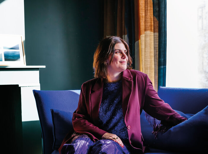
Dark colours have a bit of a bad reputation. The moment a room is small, they are often the first thing to be ruled out. Dark colours are heavy, they make the space feel smaller, they are too overpowering. So we stick to white, neutrals, the safe option.
And yet, when used well, dark colours can do exactly the opposite: they reduce visual noise.
Fewer breaks, more calm
Instead of dividing the space with edges, corners and transitions, deep tones allow all the elements to blend into one another. Your eye no longer jumps from the wall to the ceiling, then to the skirting boards. You start to see the room as one whole.
And that is where everything changes. A small room does not necessarily feel smaller, but simply more considered, more complete. This effect works particularly well in hallways, bathrooms and bedrooms. These are spaces that do not need to be filled with things, but can gain so much from a little atmosphere.
The secret: do not stop halfway
This is often where things get tricky. One dark wall, a white ceiling, contrasting skirting boards. And that is exactly what breaks the effect, because all those contrasts reintroduce the visual interruptions you were trying to get rid of.
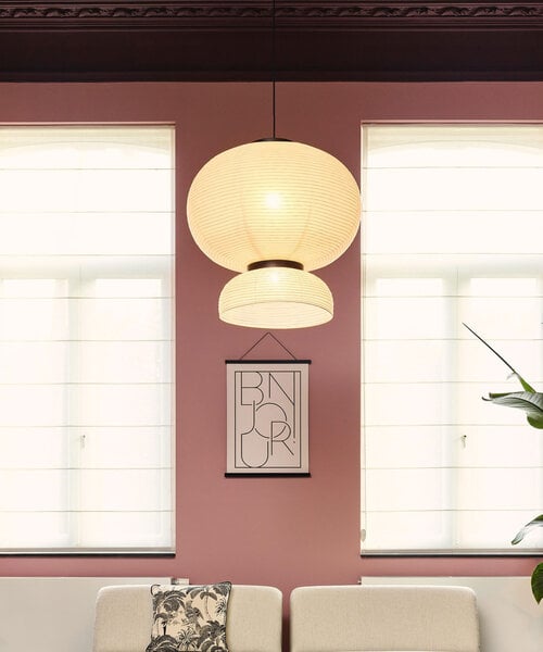
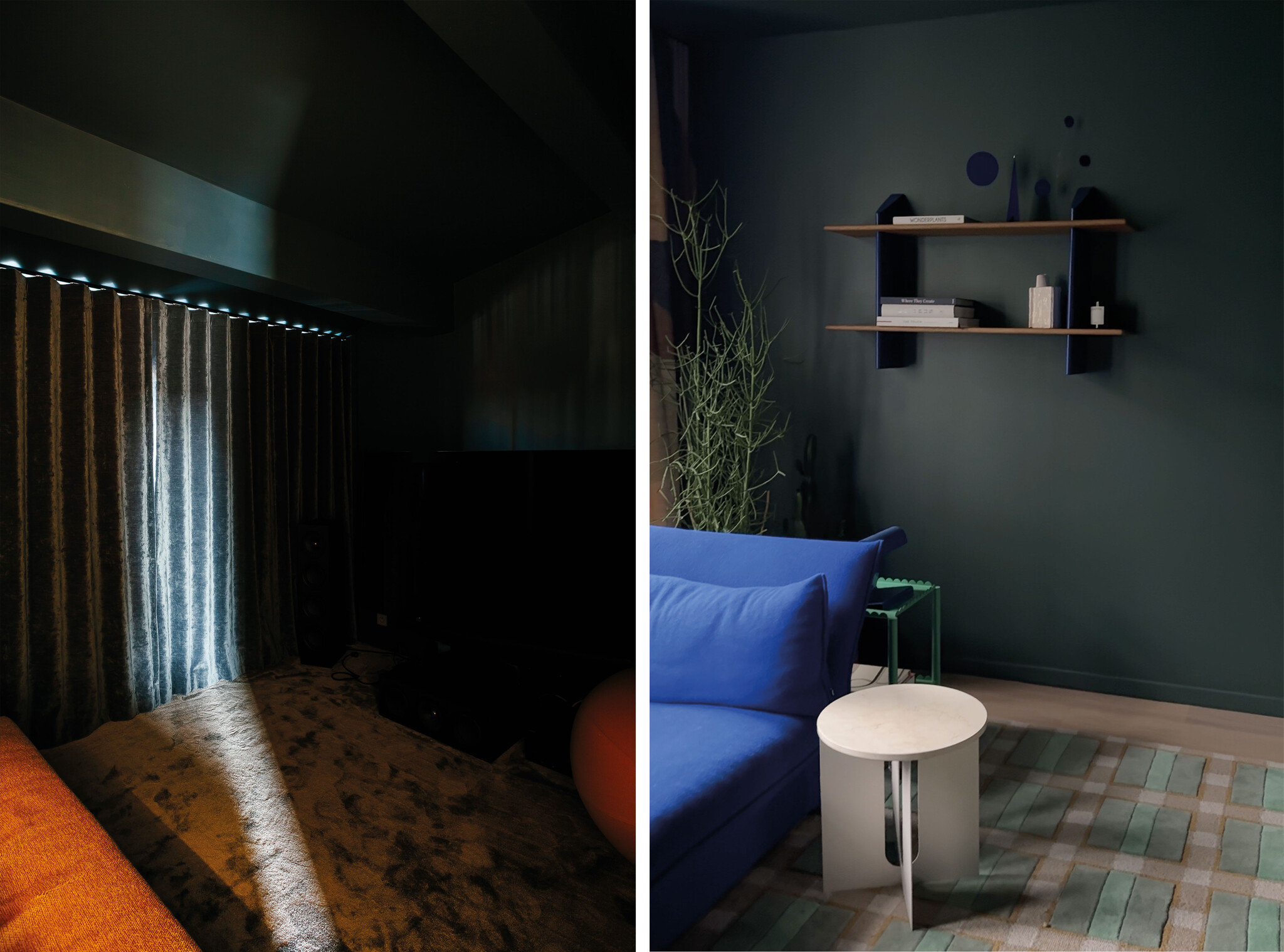
If you go all the way, with the walls, doors and ceiling in the same shade, you create a real cocoon effect. The room stops feeling like a collection of separate elements and becomes one whole, shaped by light rather than contrasts.
The best colours for creating this effect are neither flat nor harsh. Think deep, earthy greens, warm browns, muted reds or charcoal tones with soft undertones. Colours that gently absorb the light rather than swallowing it up.
A strong interior is not always about adding more things. Sometimes, it is about removing everything that interrupts the way you experience the space. A small room does not need to be protected from dark colours. It simply needs to be designed with them in mind.